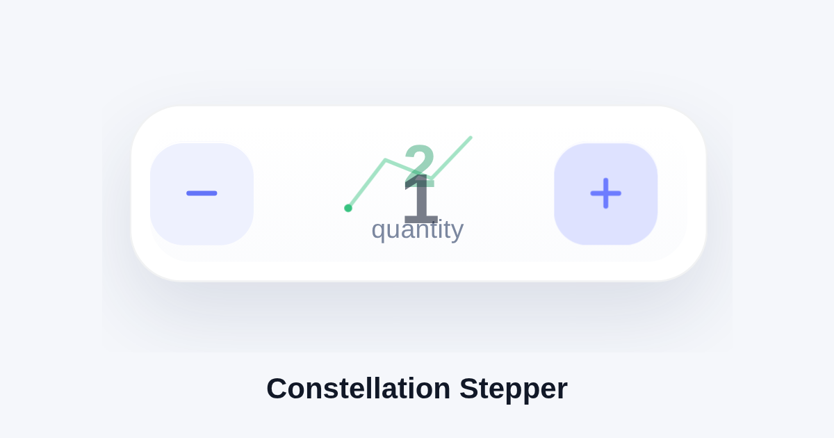
Constellation Stepper
A polished quantity stepper where tapping the plus button sends the number upward through a tiny orbital burst, then resolves into a green constellation-like success flourish before easing back to one.
HTMLconstellation-stepper.html
<!doctype html>
<html lang="en">
<head>
<meta charset="utf-8" />
<meta name="viewport" content="width=device-width, initial-scale=1" />
<title>Constellation stepper</title>

  <link rel="stylesheet" href="constellation-stepper.css" />
</head>
<body>
  <div class="stepper" aria-label="Quantity stepper">
    <button class="btn minus disabled" type="button" aria-label="Decrease quantity">
      <svg viewBox="0 0 24 24" fill="none" stroke="currentColor" stroke-width="2.6" stroke-linecap="round">
        <path d="M5 12h14"></path>
      </svg>
    </button>
    <div class="readout" aria-live="polite">
      <div class="value-wrap">
        <div class="value current">1</div>
        <div class="value next">2</div>
      </div>
      <div class="caption">quantity</div>
    </div>
    <button class="btn plus" type="button" aria-label="Increase quantity">
      <svg viewBox="0 0 24 24" fill="none" stroke="currentColor" stroke-width="2.6" stroke-linecap="round">
        <path d="M12 5v14"></path>
        <path d="M5 12h14"></path>
      </svg>
    </button>
    <div class="orbit" aria-hidden="true">
      <div class="ring"></div>
      <div class="ring r2"></div>
      <div class="spark s1"></div>
      <div class="spark s2"></div>
      <div class="spark s3"></div>
      <div class="spark s4"></div>
      <div class="spark s5"></div>
      <div class="spark s6"></div>
    </div>
    <div class="constellation" aria-hidden="true">
      <svg viewBox="0 0 132 132">
        <path d="M28 74 L48 48 L73 58 L94 36"></path>
        <circle cx="28" cy="74" r="4"></circle>
        <circle cx="48" cy="48" r="4"></circle>
        <circle cx="73" cy="58" r="4"></circle>
        <circle cx="94" cy="36" r="4"></circle>
      </svg>
    </div>
  </div>

  <script src="constellation-stepper.js"></script>
</body>
</html>CSSconstellation-stepper.css
:root {
    --bg: #f5f7fb;
    --ink: #182033;
    --muted: #7b879f;
    --line: #d8dfec;
    --panel: #ffffff;
    --accent: #5b6cff;
    --accent-soft: #eef1ff;
    --accent-glow: rgba(91, 108, 255, 0.18);
    --success: #14b86a;
  }
  * { box-sizing: border-box; }
  html, body { width: 100%; height: 100%; margin: 0; }
  body {
    display: flex;
    align-items: center;
    justify-content: center;
    overflow: hidden;
    background: var(--bg);
    font-family: -apple-system, BlinkMacSystemFont, "Segoe UI", Helvetica, Arial, sans-serif;
    color: var(--ink);
  }
  body.no-transition, body.no-transition * {
    transition: none !important;
    animation: none !important;
  }
  .stepper {
    position: relative;
    width: 312px;
    height: 96px;
    border: 1px solid rgba(24, 32, 51, 0.06);
    border-radius: 28px;
    background: var(--panel);
    box-shadow: 0 18px 42px rgba(32, 52, 94, 0.12), inset 0 1px 0 rgba(255,255,255,0.8);
    display: grid;
    grid-template-columns: 72px 1fr 72px;
    align-items: center;
    padding: 0 10px;
  }
  .stepper::before {
    content: "";
    position: absolute;
    inset: 10px;
    border-radius: 22px;
    background: linear-gradient(180deg, rgba(255,255,255,0.8), rgba(245,247,251,0.4));
    pointer-events: none;
  }
  .btn {
    position: relative;
    z-index: 1;
    width: 56px;
    height: 56px;
    border: none;
    border-radius: 18px;
    background: var(--accent-soft);
    color: var(--accent);
    display: inline-flex;
    align-items: center;
    justify-content: center;
    cursor: pointer;
    transition: transform 220ms cubic-bezier(0.22, 1, 0.36, 1), background 220ms ease, color 220ms ease, box-shadow 220ms ease;
    box-shadow: inset 0 1px 0 rgba(255,255,255,0.9);
  }
  .btn:active { transform: scale(0.94); }
  .btn svg { width: 24px; height: 24px; }
  .btn.minus.disabled {
    background: #f0f3f9;
    color: #a6b1c4;
  }
  .btn.plus.pulse {
    background: var(--accent);
    color: #fff;
    box-shadow: 0 0 0 10px rgba(91,108,255,0), 0 10px 24px rgba(91,108,255,0.25);
  }
  .readout {
    position: relative;
    z-index: 1;
    height: 64px;
    display: flex;
    align-items: center;
    justify-content: center;
    flex-direction: column;
    gap: 4px;
  }
  .value-wrap {
    position: relative;
    width: 96px;
    height: 34px;
    overflow: visible;
  }
  .value {
    position: absolute;
    inset: 0;
    display: flex;
    align-items: center;
    justify-content: center;
    font-size: 34px;
    line-height: 1;
    font-weight: 700;
    letter-spacing: -0.04em;
    color: var(--ink);
    opacity: 1;
    transform: translateY(0) scale(1);
    transition: transform 520ms cubic-bezier(0.22, 1, 0.36, 1), opacity 520ms ease, color 280ms ease;
  }
  .stepper.animating-up .value.current {
    transform: translateY(-18px) scale(0.82);
    opacity: 0;
  }
  .stepper.animating-up .value.next {
    transform: translateY(0) scale(1);
    opacity: 1;
  }
  .stepper.settled .value.current.done {
    color: var(--success);
  }
  .value.next {
    transform: translateY(18px) scale(1.16);
    opacity: 0;
  }
  .caption {
    font-size: 14px;
    color: var(--muted);
    letter-spacing: 0.01em;
  }
  .orbit {
    position: absolute;
    left: 50%;
    top: 50%;
    width: 162px;
    height: 162px;
    transform: translate(-50%, -50%);
    pointer-events: none;
    opacity: 0;
  }
  .stepper.animating-up .orbit {
    opacity: 1;
    transition: opacity 120ms ease;
  }
  .ring {
    position: absolute;
    left: 50%;
    top: 50%;
    width: 118px;
    height: 118px;
    margin-left: -59px;
    margin-top: -59px;
    border-radius: 50%;
    border: 1.5px solid rgba(91, 108, 255, 0.16);
    transform: scale(0.86);
    opacity: 0;
  }
  .stepper.animating-up .ring {
    animation: ring-pop 760ms cubic-bezier(0.16, 1, 0.3, 1) forwards;
  }
  .ring.r2 {
    width: 146px;
    height: 146px;
    margin-left: -73px;
    margin-top: -73px;
    animation-delay: 80ms !important;
  }
  @keyframes ring-pop {
    0% { transform: scale(0.78); opacity: 0; }
    20% { opacity: 1; }
    70% { transform: scale(1); opacity: 0.75; }
    100% { transform: scale(1.08); opacity: 0; }
  }
  .spark {
    position: absolute;
    left: 50%;
    top: 50%;
    width: 10px;
    height: 10px;
    margin-left: -5px;
    margin-top: -5px;
    border-radius: 50%;
    background: radial-gradient(circle at 35% 35%, #ffffff 0 24%, #aeb8ff 28%, var(--accent) 68%, rgba(91,108,255,0) 72%);
    opacity: 0;
  }
  .stepper.animating-up .spark { animation: orbit 860ms cubic-bezier(0.22, 1, 0.36, 1) forwards; }
  .spark.s1 { --dx: 0px; --dy: -64px; animation-delay: 0ms; }
  .spark.s2 { --dx: 54px; --dy: -28px; animation-delay: 60ms; }
  .spark.s3 { --dx: 60px; --dy: 30px; animation-delay: 110ms; }
  .spark.s4 { --dx: 0px; --dy: 68px; animation-delay: 170ms; }
  .spark.s5 { --dx: -58px; --dy: 26px; animation-delay: 230ms; }
  .spark.s6 { --dx: -52px; --dy: -30px; animation-delay: 290ms; }
  @keyframes orbit {
    0% { transform: translate(0, 0) scale(0.2); opacity: 0; }
    18% { opacity: 1; }
    55% { transform: translate(calc(var(--dx) * 0.75), calc(var(--dy) * 0.75)) scale(1); opacity: 1; }
    100% { transform: translate(var(--dx), var(--dy)) scale(0.35); opacity: 0; }
  }
  .constellation {
    position: absolute;
    left: 50%;
    top: 50%;
    width: 132px;
    height: 132px;
    transform: translate(-50%, -50%);
    opacity: 0;
  }
  .stepper.settled .constellation {
    opacity: 1;
    transition: opacity 240ms ease;
  }
  .constellation svg {
    width: 100%;
    height: 100%;
    overflow: visible;
  }
  .constellation path {
    fill: none;
    stroke: rgba(20, 184, 106, 0.45);
    stroke-width: 2;
    stroke-linecap: round;
    stroke-linejoin: round;
    stroke-dasharray: 180;
    stroke-dashoffset: 180;
  }
  .constellation circle {
    fill: var(--success);
    transform-origin: center;
    transform-box: fill-box;
    transform: scale(0);
  }
  .stepper.settled .constellation path {
    animation: draw 680ms cubic-bezier(0.22, 1, 0.36, 1) forwards;
  }
  .stepper.settled .constellation circle {
    animation: star-in 300ms cubic-bezier(0.22, 1, 0.36, 1) forwards;
  }
  .stepper.settled .constellation circle:nth-of-type(1) { animation-delay: 90ms; }
  .stepper.settled .constellation circle:nth-of-type(2) { animation-delay: 150ms; }
  .stepper.settled .constellation circle:nth-of-type(3) { animation-delay: 210ms; }
  .stepper.settled .constellation circle:nth-of-type(4) { animation-delay: 270ms; }
  @keyframes draw { to { stroke-dashoffset: 0; } }
@keyframes star-in { to { transform: scale(1); } }JSconstellation-stepper.js
(function () {
  var stepper = document.querySelector('.stepper');
  var minus = document.querySelector('.minus');
  var plus = document.querySelector('.plus');
  var current = document.querySelector('.value.current');
  var next = document.querySelector('.value.next');
  var timers = [];
  var state = 1;

  function clearTimers() {
    timers.forEach(function (id) { clearTimeout(id); });
    timers = [];
  }
  function schedule(fn, delay) {
    var id = setTimeout(fn, delay);
    timers.push(id);
    return id;
  }
  function renderBase() {
    current.textContent = String(state);
    next.textContent = state === 1 ? '2' : '1';
    minus.classList.toggle('disabled', state === 1);
  }
  function resetVisualClasses() {
    stepper.classList.remove('animating-up', 'settled');
    plus.classList.remove('pulse');
    current.classList.remove('done');
  }
  function runIncrease() {
    if (state !== 1) return;
    clearTimers();
    resetVisualClasses();
    next.textContent = '2';
    plus.classList.add('pulse');
    stepper.classList.add('animating-up');

    schedule(function () {
      state = 2;
      stepper.classList.remove('animating-up');
      current.textContent = '2';
      next.textContent = '1';
      plus.classList.remove('pulse');
      minus.classList.remove('disabled');
      stepper.classList.add('settled');
      current.classList.add('done');
    }, 860);

    schedule(function () {
      stepper.classList.remove('settled');
      current.classList.remove('done');
    }, 2100);

    schedule(function () {
      state = 1;
      renderBase();
    }, 2800);
  }

  plus.addEventListener('click', runIncrease);
  minus.addEventListener('click', function () {});

  window.__demo = {
    reset: function () {
      clearTimers();
      document.body.classList.add('no-transition');
      state = 1;
      resetVisualClasses();
      renderBase();
      void document.body.offsetHeight;
      document.body.classList.remove('no-transition');
    }
  };

  renderBase();
})();